

EXPAND ALL
- Home
- About Pixie
- Installing Pixie
- Using Pixie
- Tutorials
- Reference

In Tutorial #3 you learned how write a Vis Spec in order to visualize the PxL script query output as a table in the Live UI.
In this tutorial, we will add two time series charts to our Vis Spec:
We will continue to use the Live UI's Scratch Pad to develop our scripts. Let's set it up with the first version of the PxL Script and Vis Spec we developed in Tutorial #3:
Open Pixie's Live UI.
Select the Scratch Pad script from the script drop-down menu in the top left.
Open the script editor using the keyboard shortcut: ctrl+e (Windows, Linux) or cmd+e (Mac).
Replace the contents of the PxL Script tab with the following:
1# Import Pixie's module for querying data2import px34def network_traffic_per_pod(start_time: str):56 # Load the `conn_stats` table into a Dataframe.7 df = px.DataFrame(table='conn_stats', start_time=start_time)89 # Each record contains contextual information that can be accessed by the reading ctx.10 df.pod = df.ctx['pod']11 df.service = df.ctx['service']1213 # Calculate connection stats for each process for each unique pod.14 df = df.groupby(['service', 'pod', 'upid']).agg(15 # The fields below are counters per UPID, so we take16 # the min (starting value) and the max (ending value) to subtract them.17 bytes_sent_min=('bytes_sent', px.min),18 bytes_sent_max=('bytes_sent', px.max),19 bytes_recv_min=('bytes_recv', px.min),20 bytes_recv_max=('bytes_recv', px.max),21 )2223 # Calculate connection stats over the time window.24 df.bytes_sent = df.bytes_sent_max - df.bytes_sent_min25 df.bytes_recv = df.bytes_recv_max - df.bytes_recv_min2627 # Calculate connection stats for each unique pod. Since there28 # may be multiple processes per pod we perform an additional aggregation to29 # consolidate those into one entry.30 df = df.groupby(['service', 'pod']).agg(31 bytes_sent=('bytes_sent', px.sum),32 bytes_recv=('bytes_recv', px.sum),33 )3435 # Filter out connections that don't have their service identified.36 df = df[df.service != '']3738 return df
Vis Spec tab with the following:1{2 "variables": [3 {4 "name": "start_time",5 "type": "PX_STRING",6 "description": "The relative start time of the window. Current time is assumed to be now",7 "defaultValue": "-5m"8 }9 ],10 "widgets": [11 {12 "name": "Network Traffic per Pod",13 "position": {14 "x": 0,15 "y": 0,16 "w": 12,17 "h": 318 },19 "func": {20 "name": "network_traffic_per_pod",21 "args": [22 {23 "name": "start_time",24 "variable": "start_time"25 }26 ]27 },28 "displaySpec": {29 "@type": "types.px.dev/px.vispb.Table"30 }31 }32 ],33 "globalFuncs": []34}
RUN button or keyboard shortcut: ctrl+enter (Windows, Linux) or cmd+enter (Mac).Our PxL script contains a single network_traffic_per_pod() function. This function calculates two values for each pod in our cluster: total bytes sent and total bytes received (for the selected time window).
In order to add time series charts to our Live View, we'll need to calculate time series data for each metric (bytes sent and bytes received). Let's add a second function to our PxL script to do that:
PxL Script tab with the following:1# Import Pixie's module for querying data2import px34def network_traffic_per_pod(start_time: str):56 # Load the `conn_stats` table into a Dataframe.7 df = px.DataFrame(table='conn_stats', start_time=start_time)89 # Each record contains contextual information that can be accessed by the reading ctx.10 df.pod = df.ctx['pod']11 df.service = df.ctx['service']1213 # Calculate connection stats for each process for each unique pod.14 df = df.groupby(['service', 'pod', 'upid']).agg(15 # The fields below are counters per UPID, so we take16 # the min (starting value) and the max (ending value) to subtract them.17 bytes_sent_min=('bytes_sent', px.min),18 bytes_sent_max=('bytes_sent', px.max),19 bytes_recv_min=('bytes_recv', px.min),20 bytes_recv_max=('bytes_recv', px.max),21 )2223 # Calculate connection stats over the time window.24 df.bytes_sent = df.bytes_sent_max - df.bytes_sent_min25 df.bytes_recv = df.bytes_recv_max - df.bytes_recv_min2627 # Calculate connection stats for each unique pod. Since there28 # may be multiple processes per pod we perform an additional aggregation to29 # consolidate those into one entry.30 df = df.groupby(['service', 'pod']).agg(31 bytes_sent=('bytes_sent', px.sum),32 bytes_recv=('bytes_recv', px.sum),33 )3435 # Filter out connections that don't have their service identified.36 df = df[df.service != '']3738 return df3940def network_traffic_timeseries(start_time: str):4142 # Load the `conn_stats` table into a Dataframe.43 df = px.DataFrame(table='conn_stats', start_time=start_time)4445 # Each record contains contextual information that can be accessed by the reading ctx.46 df.pod = df.ctx['pod']4748 # Window size to use on time_ column for bucketing.49 ns_per_s = 1000 * 1000 * 100050 window_ns = px.DurationNanos(10 * ns_per_s)51 df.timestamp = px.bin(df.time_, window_ns)5253 # Calculate connection stats for each unique pod / upid / timestamp pair.54 df = df.groupby(['pod', 'upid', 'timestamp']).agg(55 # The fields below are counters per UPID, so we take56 # the min (starting value) and the max (ending value) to subtract them.57 bytes_sent_min=('bytes_sent', px.min),58 bytes_sent_max=('bytes_sent', px.max),59 bytes_recv_min=('bytes_recv', px.min),60 bytes_recv_max=('bytes_recv', px.max),61 )6263 # Calculate connection stats over the time window.64 df.bytes_sent = df.bytes_sent_max - df.bytes_sent_min65 df.bytes_recv = df.bytes_recv_max - df.bytes_recv_min6667 # Calculate connection stats for each unique pod / timestamp pair. Since there68 # may be multiple processes per pod we perform an additional aggregation to69 # consolidate those into one entry.70 df = df.groupby(['pod', 'timestamp']).agg(71 bytes_sent=('bytes_sent', px.sum),72 bytes_recv=('bytes_recv', px.sum),73 )7475 # The timeseries chart widget expects a `time_` column76 df.time_ = df.timestamp77 df = df.drop('timestamp')7879 return df
On
line 40we define a new function callednetwork_traffic_timeseries().
On
line 43we create a DataFrame and populate it with data from the sameconn_statstelemetry data table.
On
line 46we use thectxfunction to add apodcolumn which contains the name of the pod that initiated the traced connection.
On
lines 49-51we use thebinfunction to create atimestampcolumn from thetime_column. Thetimestampcolumn contains the values in thetime_column rounded down to the nearest multiple of 10 seconds.
On
lines 54-73we group and aggregate the connection stats according to unique pod and timestamp pairs.
The time series chart widget expects a
time_column in the DataFrame, so online 76we rename thetimestampcolumn totime_.
Let's add two time series chart widgets to our Vis Spec:
Vis Spec tab with the following:1{2 "variables": [3 {4 "name": "start_time",5 "type": "PX_STRING",6 "description": "The relative start time of the window. Current time is assumed to be now",7 "defaultValue": "-5m"8 }9 ],10 "widgets": [11 {12 "name": "Network Traffic per Pod",13 "position": {14 "x": 0,15 "y": 0,16 "w": 12,17 "h": 318 },19 "func": {20 "name": "network_traffic_per_pod",21 "args": [22 {23 "name": "start_time",24 "variable": "start_time"25 }26 ]27 },28 "displaySpec": {29 "@type": "types.px.dev/px.vispb.Table",30 "gutterColumn": "status"31 }32 },33 {34 "name": "Bytes Sent",35 "position": {36 "x": 0,37 "y": 3,38 "w": 6,39 "h": 340 },41 "globalFuncOutputName": "resource_timeseries",42 "displaySpec": {43 "@type": "types.px.dev/px.vispb.TimeseriesChart",44 "timeseries": [45 {46 "value": "bytes_sent",47 "mode": "MODE_LINE",48 "series": "pod"49 }50 ],51 "title": "",52 "yAxis": {53 "label": "Bytes sent"54 },55 "xAxis": null56 }57 },58 {59 "name": "Bytes Received",60 "position": {61 "x": 6,62 "y": 3,63 "w": 6,64 "h": 365 },66 "globalFuncOutputName": "resource_timeseries",67 "displaySpec": {68 "@type": "types.px.dev/px.vispb.TimeseriesChart",69 "timeseries": [70 {71 "value": "bytes_recv",72 "mode": "MODE_LINE",73 "series": "pod"74 }75 ],76 "title": "",77 "yAxis": {78 "label": "Bytes received"79 },80 "xAxis": null81 }82 }83 ],84 "globalFuncs": [85 {86 "outputName": "resource_timeseries",87 "func": {88 "name": "network_traffic_timeseries",89 "args": [90 {91 "name": "start_time",92 "variable": "start_time"93 }94 ]95 }96 }97 ]98}
On
lines 85-96we add our newnetwork_traffic_timeseries()function to theglobalFuncslist. This function will be used by both of the time series chart widgets that we will add next.
On
lines 33-57we add a new times series chart widget named "Bytes Sent":
- The time series widget contains the same
nameandpositionfields as the table widget.
- Instead of using the
funcfield to define the function inline (as we did with the table widget), we use theglobalFuncOutputNamefield to reference our global function.
- In the
displaySpecfield we use thetimeseriesfield to define thevalueandseries. This chart will plot thebytes_sentvalues for eachpodseries.
On
lines 58-82we add a widget named "Bytes Received" that is identical to the "Bytes Sent" chart, but instead plots thebytes_recvcolumn of values from theresource_timeseriesfunction output table.
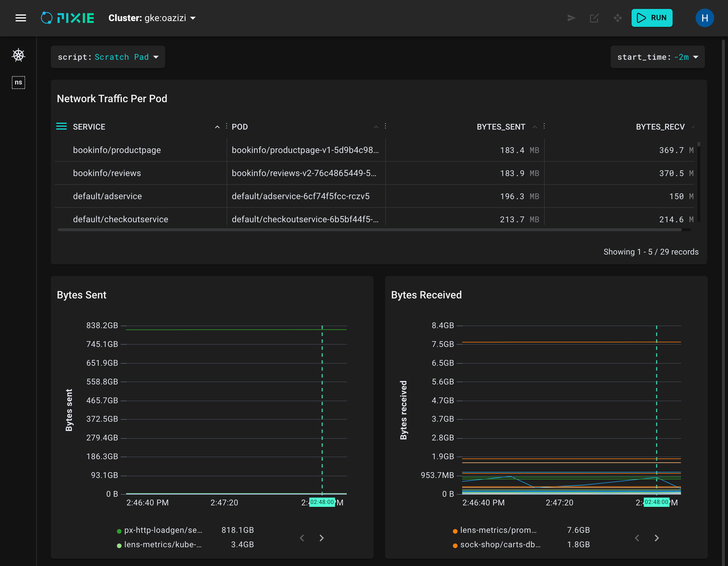
ctrl+enter (Windows, Linux) or cmd+enter (Mac).Your Live UI output should now contain two charts in addition to the table:
Congratulations, you edited your PxL script and Vis Spec to produce a time series chart in the Live UI!
Tables and time series charts are useful for visualizing your observability data, but graphs can help you even more quickly make sense of what's happening with your Kubernetes applications. In Tutorial #5 we'll add a graph to our Live View.
